Show them how close
they are to a reward.
Give members a reason to come back. Use personalized charts to show their points, purchases and progress in the loyalty emails you already send.
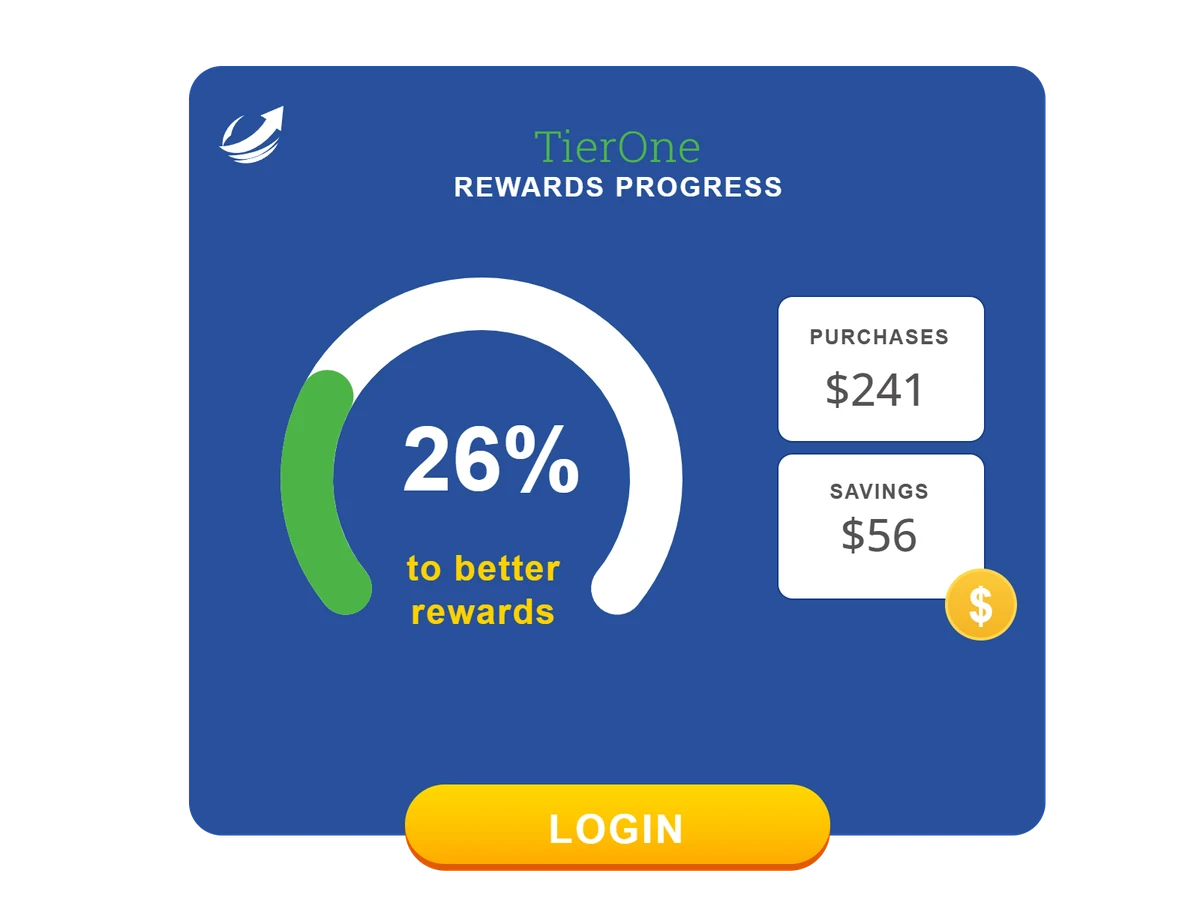
Give every member
their own progress report.
Turn a points balance into a reason to explore the next reward. Put the member's current total beside the goal, with purchases and referrals in the same image.
Create one design, then use your email platform's merge tags to supply each recipient's values. These examples cycle through different balances to show how the same design can change.
Try a chart with your data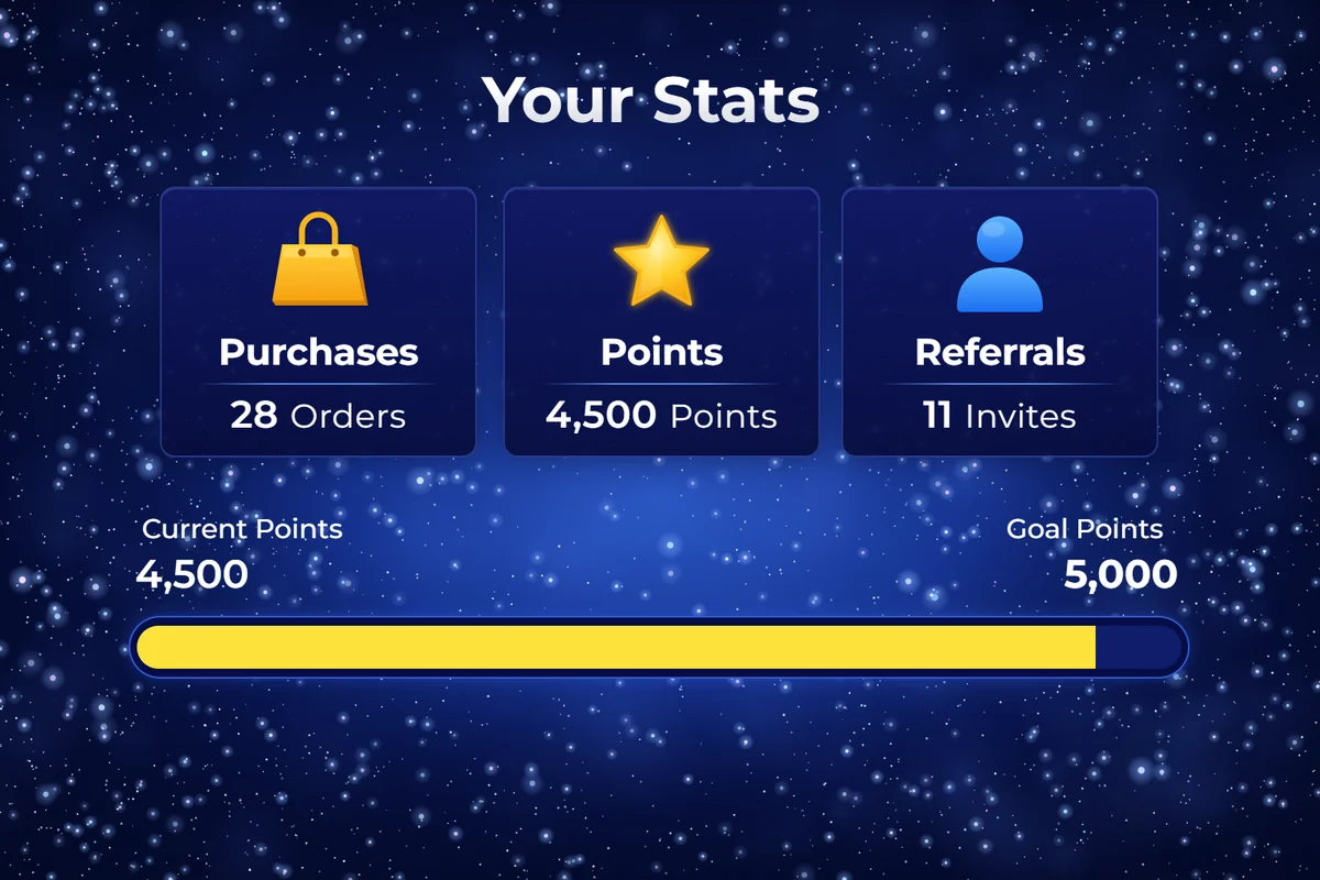
Make the numbers
easier to understand.
A monthly activity email can show a trend. A spending summary can show where the money went. Choose the chart that helps your recipient read their data.
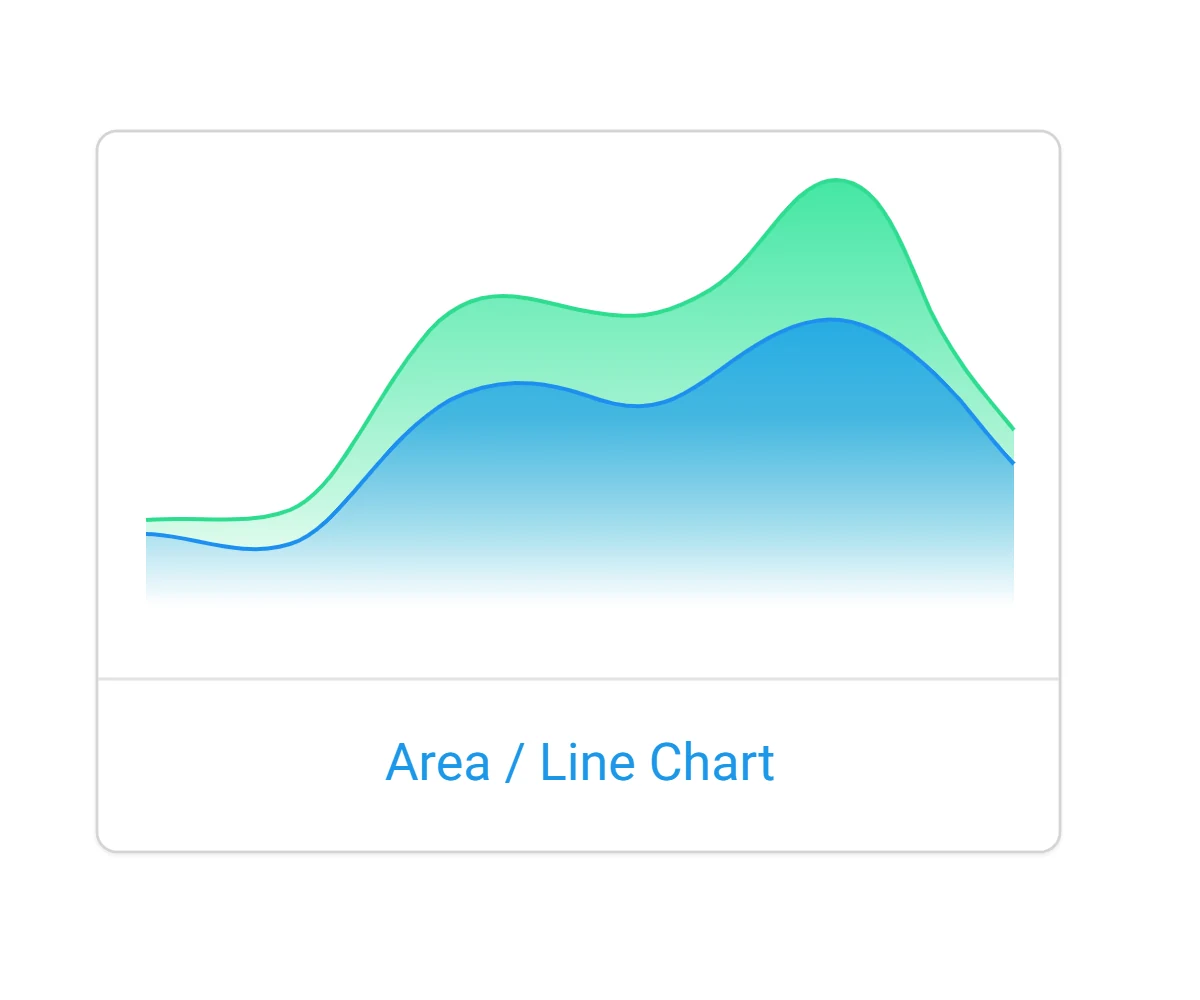
Set your colors, labels, legends and background. Adjust dimensions, padding and axes where the chart supports them. You can also create barcodes for membership or redemption emails.
Show supporters
how their donations add up.
Make a fundraising update concrete. Show the total raised and the share of the target it represents, then invite supporters to help close the gap.
Use values supplied in the email, or connect a full Data Store or External Web API for totals that can change after sending. Connected data is read when the image is requested. Data-source and email-client caching can affect when changes appear.
Full Data Stores and External Web APIs require Business.
Explore connected data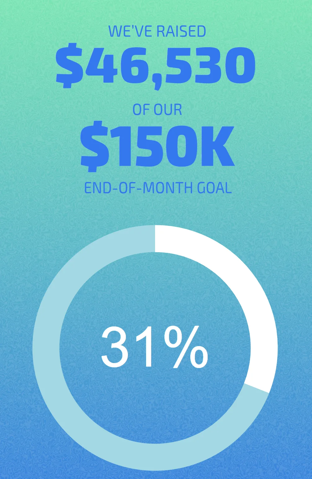
Build it once.
Make it personal.
Use a chart on its own, or add it as a layer in a Personalized Image with your logo, customer details and campaign artwork.
Charts render as images in major email clients. Your email platform needs to support merge tags in image URLs to supply different values for each recipient.
Explore personalized imagesChoose and style your chart
Pick a chart type, set the colors and labels, and decide which values should change.
Add recipient values
Map the fields from your email platform to the chart. Keep shared values, such as a goal, fixed when they are the same for everyone.
Check it in your email
Add the image URL to your template. Send a test with representative recipient data and check the chart before sending your campaign.
Give their next milestone
a place in your email.
Start with a points balance or a goal. Build a chart that makes it personal.
Create your first chart